Curious about crafting a landing page to boost up your lead generation or make more sales? Well, you’re in luck!
In this comprehensive guide, you’ll discover:
- what a landing page is
- the difference between a landing page and a website
- the anatomy of a successful landing page
- how to create one in 11 simple steps
…with no knowledge of design or technology!
What Is A Landing Page?
A landing page is a special webpage designed for visitors to arrive at after clicking a link in an email or an ad on platforms like Google, Facebook, or YouTube. Its sole purpose is to guide visitors towards taking a specific action, often known as a call-to-action (CTA).
What Are Landing Pages Used For?
Advertising and marketing are two uses for landing pages. In particular, marketers utilise them primarily for two purposes:
to entice visitors to buy something or give their contact details;
to give the visitor interesting, relevant information; or to give a synopsis of a product or service
What’s the Difference Between a Landing Page and a Website?
A landing page and a website vary primarily in that they have different goals. Landing pages exist just to encourage a certain activity, whereas websites are made to be browsed by visitors.
The following diagram illustrates the key differences between websites and landing pages:
| Website | Landing Pages |
|---|---|
| General | Specific with clear goal |
| Designed for exploration | Designed for conversions |
| Multiple options | Only one option (CTA) |
| Traffic comes from multiple sources | Traffic comes from ads |
| Many potential distractions | Minimal distractions |
Typically, landing pages are designed with a singular objective in mind, such as collecting signups, and are utilized as part of a targeted campaign, like PPC, paid social, or email marketing.
As a result, landing pages aren’t in direct competition with websites and homepages. Instead, they’re better suited for specific purposes or campaigns, providing a focused platform to achieve a particular goal.
Do You Need a Website for a Landing Page?
While it’s not mandatory to have a website to create a landing page, having one is highly recommended as it fosters trust with your audience. Hosting a landing page separately from your website is simple to do.
Having both a website and landing pages is beneficial because it demonstrates to potential customers that your brand is credible and established. Since online shoppers often rely on trust when making purchases, having a website is a wise decision.
What Makes a Good Landing Page?
A well-crafted landing page effectively communicates its value proposition through clear and consistent messaging.
The graph below shows other equally significant landing page success factors:
| What Makes a Good Landing Page? |
|---|
| Minimalist design |
| Strong Call-to-Action |
| Testimonials |
| Messaging consistency |
| Clear copy |
| Authenticity |
When someone visits a landing page, they should see what’s expected of them. Therefore, the landing page’s content—and particularly its copy—must correspond with the original.
What are the Key Components of a Landing Page?
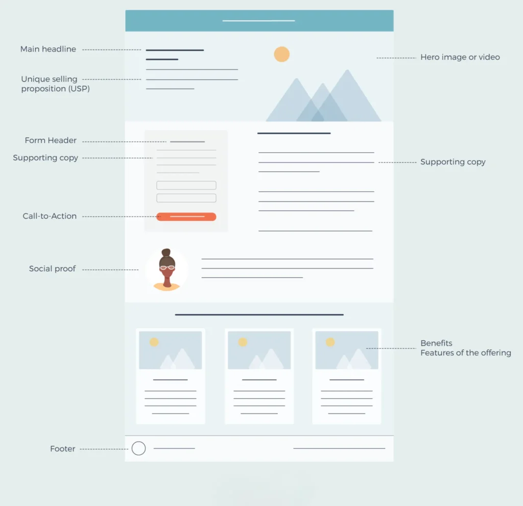
A landing page’s primary headline and accompanying language, unique selling proposition (USP), hero picture or video, benefits/features of your service, social proof, and conversion point (also known as a CTA) are its seven essential components.
You can see an example of those seven essential components that each excellent landing page has to have below. To view in larger size, click.

It’s time to discover how you may quickly and easily design a high-converting landing page without any prior experience!
How To Create A Landing Page For Free
You don’t need to know how to code to develop, modify, and present eye-catching landing pages to your audience with Octaadsmedia, an all-in-one marketing suite.
A landing page may be created entirely from scratch or it can be customised to fit your brand and objectives by using one of the many expertly created templates. Naturally, all of your landing pages will be adaptable to mobile devices so you can make the most of the traffic that comes from tablets and smartphones. Advanced features like countdown timers may also be added to your landing pages, creating a potent combination that will increase sales and income.
You are only allowed to build one landing page with a free account. You may expand your audience and increase sales without any restrictions by upgrading to the Pro plan, which allows you to construct an infinite number of landing pages and subscription forms!
- Specify the objective of your campaign.
- Decide on a template for a landing page.
- Write the piece of content.
- Make a persuasive appeal for action
- Include social proof and visual content
- Incorporate branding components.
- Include tracking
- Configure SEO.
- Get your landing page published after previewing it.
- Get your landing page optimised.
Step #1: Define Your Campaign Goal
You must first determine WHY you want to design your amazing landing page before you can begin.
A well-designed landing page must have a quantifiable and explicit objective. This will assist you in choosing the best template to use, what to include on the page, and how to create your material.
So, your call to action may lead visitors to:
- Complete a survey or form.
- Get a free trial by registering.
- Get a free ebook here.
- Purchase a product
- Make a webinar registration.
- Give their contact details.
- Download a discount.
- Take out a newsletter subscription
It is crucial to stick to one objective since it reduces the options you provide your visitors and makes it much simpler to design a landing page that is actually effective.
So, what will it be for you?
Step #2: Select a Landing Page Template
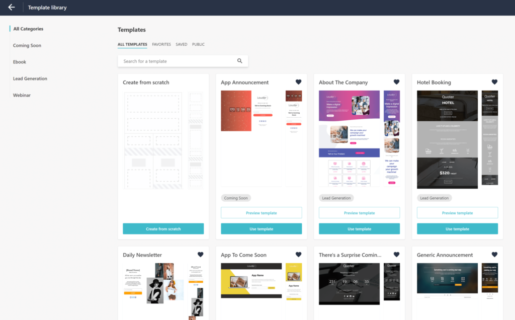
Choosing the right landing page design comes next after deciding what you want to achieve. Because you can utilise and expand upon a pre-made template’s layout, it makes more sense to employ one rather than start from scratch.
To boost productivity and save time, a variety of templates are provided by the majority of landing page builders.

As you can see, the templates are typically categorised, making it simple to choose one. Look through the templates that are available and pick the one that best fits your requirements.
You may now personalise it!
Step #3: Write Your Copy
The first thing you’ll need to work on is the headline. You have about 8 seconds to capture visitors’ attention, so create a snappy title. Make sure your title is clear and attention-grabbing. Ideally, your title should reflect the message of the email or advertisement that sent people to your landing page.

The remaining material on the landing page is twice as significant in terms of conversion rates. To write effective content, emphasise how your service will address people’ issues and make their lives simpler. In essence, you must focus on the benefits and portray them from the visitor’s standpoint.
A common advice for creating a high-converting landing page is to make your words brief and valuable. Remove any extraneous information and eliminate misleading business jargon.
Step #4: Create an Irresistible Call-To-Action
After you’ve written your headline and accompanying material, it’s time to convert your intended audience with an attractive CTA button.
Your CTA (or call-to-action) specifies what you want visitors to do on your landing page. This might be in the form of a form or a clickable button.
To achieve the best results, you must first ensure that your call-to-action is explicit and detailed. Visitors should know what to expect when they click your CTA button. Here’s an example from Lemon Squeezy.

For SaaS businesses CTAs like “See Pricing” or “Start Your Free Trial” are effective.
Furthermore, if your landing page includes a form, try to keep it as basic as possible (the most effective forms have only one field – the email address).
Finally, remove any distractions that may divert your visitors’ attention away from your call to action. Ideally, avoid including navigation links to other pages, headers, or footers. Also, just use one CTA.
To achieve the optimal user experience, consider removing the top navigation bar from the preceding example.
Step #5: Use Visual Content
You’ve done writing your content; now it’s time to focus on the graphics for your landing page. You’ll need to chose which photographs to show. These might range from commercial pictures and stock photos to personalised artwork.
Visual aids make your message more understandable, enhance it, and impact your landing page visitors’ behaviour. This implies you can get more conversions! Furthermore, compelling images may help you deliver your idea in a matter of seconds.
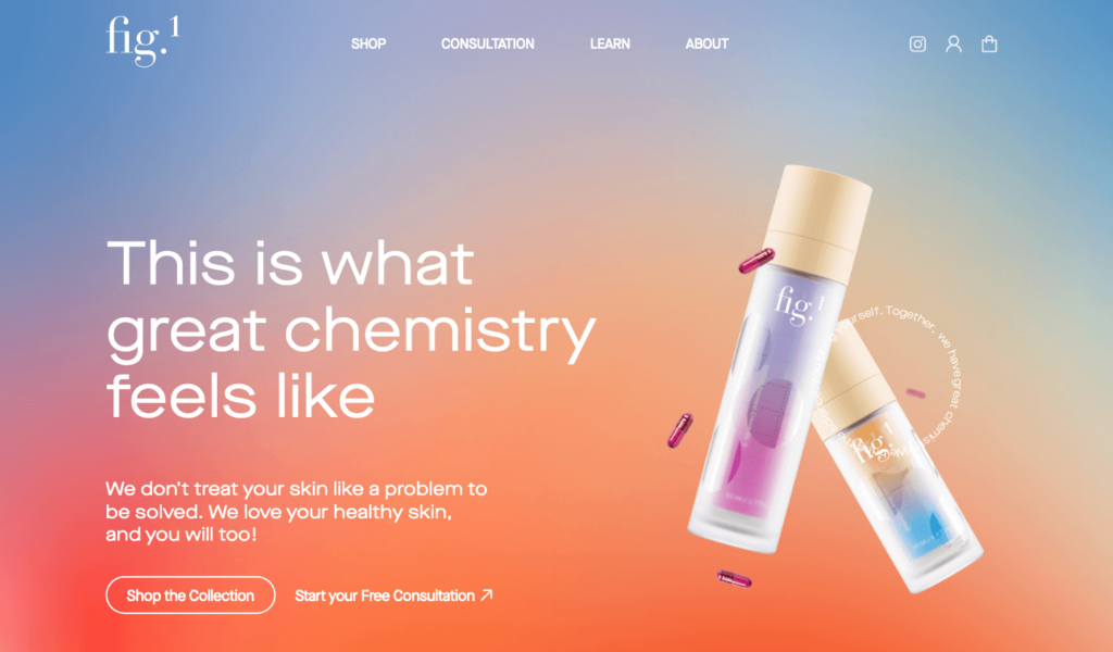
As shown in the example below, employs high-quality product photographs on their landing page to create a visual link with the content. Furthermore, the product photographs complement the backdrop colours, resulting in a distinctive landing page.

By employing the appropriate visual information, you may drive your visitor to where you want them to look and subsequently take action. In addition, they can smartly substitute text!
Here are some tips to help you choose visuals:
- Choose your hero image: a large, captivating graphic that explains what your offer is all about. To capture the attention of the viewers, it must be of professional quality.
- Use genuine photos of individuals utilising the product/service to help visitors connect with your offer on a human and emotional level.
- Use images to emphasise the benefits, assuming that visitors are busy. Help them convert by telling “a visual story” with your photographs.
- Visual aids make your message clearer and simpler to understand, as well as affect the behaviour of your landing page visitors. This means that you can boost conversions! Furthermore, strong images might help you deliver your idea in only a few seconds.
- Remember to document your progress: creating visual aids might be time-consuming. So, be sure to back up all of your valuables so you don’t have to worry about anything.
Step #6: Include Social Proof
It might be challenging to gain people’s faith in your brand while using online marketing. If a buyer is unfamiliar with you, evaluations and testimonials from others like them will boost your trustworthiness.
According to a recent Bright Local customer poll, “91% of consumers trust online reviews as much as personal recommendations”. This shows how social evidence might influence a customer.
Social proof, whether for a product or a service, may efficiently direct a visitor along the conversion funnel.
There are many different types of social proof you can use:
Testimonials
Case Studies
Customer Ratings & Reviews
Influencer Endorsements
Certifications
Brand/Client Logos
Subscriber Counts
Social Shares Counts
Storytelling
One of the finest landing page design suggestions is to arrange your social proof near the CTA button to increase the impact of your message. Finally, to create a professional-looking landing page, include a photo thumbnail and name with the testimonial. This will assist to enhance conversions.
LILT uses two sorts of social proof on the landing page shown below: customer logos and testimonials. As you can see, social proof takes up a major portion of the landing page to build trust.
Pro tip: Keep your testimonials short. A maximum of three brief phrases is ideal. You may also highlight crucial portions of the testimony by italicizing or bolding them.
Step #7: Add Branding Elements
You are now ready to begin working on the finishing touches for your new landing page. Specifically, you must offer your landing page the same appearance and feel as your website.
This implies you must include your company logo and ensure that the colours on your landing page match your brand’s colours perfectly. Furthermore, you will need to make the required changes to the colour and font of your content to provide a consistent experience for your potential consumers.
Step #8: Add Tracking
You’ve worked hard and designed your own landing page. But wait, how can you know whether it’s genuinely working well?
Actually, you don’t. Not before you include tracking in your campaign.
There is no use in designing a landing page unless you track its success.

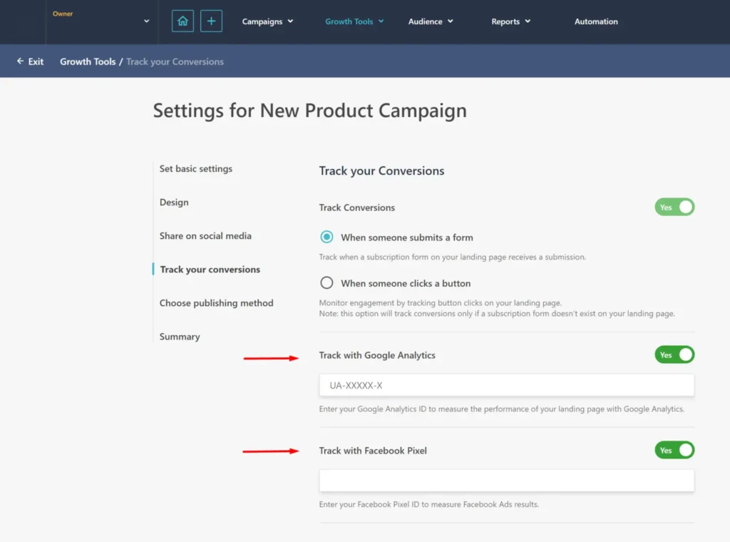
As seen in this example from the OctaadsMedia platform, you may activate tracking with Google Analytics. Simply enter your Google Analytics ID to track the success of your landing page. In addition, you may use Facebook Pixel to track your Facebook Ads outcomes.
Keeping track of who visits your landing page and what actions they take is critical for optimising your marketing efforts.
Step #9: Set SEO Settings
Last but not least, search engine optimisation. Landing pages that have been optimised in accordance with landing page best practices are sure to bring more visitors.
This happens because it is simpler for website visitors to locate your page and search engines to grasp its purpose.
When optimising your landing page, you should consider the following:
- Think of the title tag as your visitors’ initial impression of your website. While there is no specific character restriction, an ideal title tag has around 60 characters.
- Think of the title tag as your visitors’ initial impression of your website. While there is no specific character restriction, an ideal title tag has around 60 characters.
Here’s an example of how SEO settings will appear in your landing page builder tool.

After you’ve completed these steps, you’ll need to pick a publishing method. Your landing page builder will provide you with options for where you want to publish your landing page.
Step #10: Preview & Publish Your Landing Page
You are nearly ready! Before you click “Publish,” make sure everything on your landing page looks good.
First, run a quick check on the copy. Make sure there are no typos or language errors that might jeopardise your campaign and provide a negative first impression.
Then, review your design to ensure that everything is how it should be.

And..that’s it! You’re ready to publish your fabulous landing page!
Step #11: Optimize Your Landing Page
At this point, the process of creating landing pages is nearly complete. However, you should not simply post your landing page and then forget about it.
To get the best out of it, you must test and optimise it. The most effective method is to do A/B testing.
Some crucial elements to test include:
- Headline: Try an alternative variation of your headline.
- Visuals: Replace the hero picture with a new one on your page.
- CTA: Design an alternative. CTA button with a twist of copy
By running these tests, you’ll ensure that you’re getting the most out of your landing pages, whether your aim is to build your email list, sell more items, or whatever.
Landing Page Design Checklist to Download
Do you feel rushed? Or do you simply want a checklist that you can complete at your own pace?
Here’s a landing page design checklist that includes subtasks for each of the processes mentioned above. It’ll be a step-by-step guide that will transform you into a landing page expert!
If you’re wondering how to start a website, there are various stages you must take, including getting a domain name, selecting a hosting provider, creating your website, and optimising it for search engines.
Looking for a Landing Page Builder?
Landing pages are surely an important component of any digital marketing approach. With the suggestions above, you’ll be able to quickly become a landing page expert.
FAQs
Can a landing page replace a website?
Landing pages and website pages serve different purposes in marketing. Landing pages are designed with a specific goal in mind, while websites are more for exploration. Ideally, landing pages should complement your website and work together towards your marketing objectives.
Do landing pages rank on Google?
While landing pages do not rank in search engines on their own, Google considers them to be crucial components of a successful sales funnel. To rank on Google, a landing page must be optimised for keyword targeting, have supplementary content that offers value to the reader, feature more than one CTA, and load quickly.
What URL should my landing page have?
Your landing page URL should ideally “tell” your readers where the link will go them if they click on it. A excellent technique is to change your URL to something that reflects what your landing page supports. Effective URLs are generally 50 to 60 characters long.
Do I need a favicon for my landing page?
Yes! You may utilise the one you currently have for your website or build a new one as part of your promotional landing page campaign to capture people’s attention; to do so, use Hubspot’s Free Favicon Generator!
Good advice is never enough for you, huh? 🤩
We’ve got you covered; contact OctaadsMedia CEO, Abdulla khan, and seek more expert guidance!


Leave A Comment